ShopDreamUp AI ArtDreamUp
Deviation Actions


Description
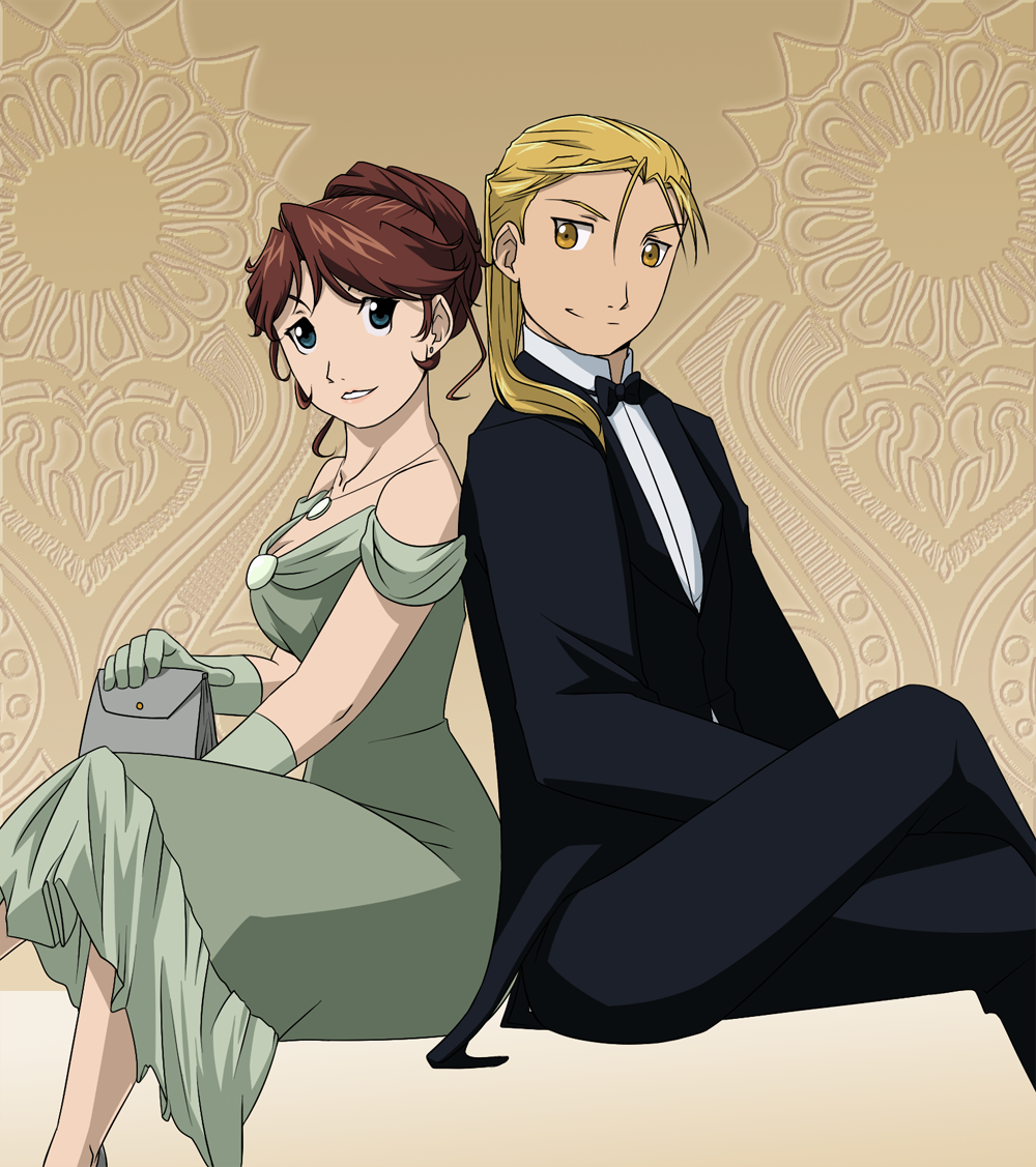
In Formal wear
Of my OTP challenge together with
 &
& 
-As fun fact, this time I must add 2 |D :
>Meta's distinctive color is green.
>She would wear a dress that let her move freely since she would spend all the night dancing (assuming they're going to a party XD) I don't like these tiny bags, but I needed something to put Meta's hand on
Also, I know I said I don't feel attracted by Ed |D But in a suit everything changes I guess. I mean, look at him, even HIM is handsome in a suit
And well, this time I felt like playing with hairdos again
This time I wanted them brighter, so I used their 03 pallets
That's all o3o/ Hope you like it


**********************************

Image size
1000x1127px 1.01 MB
© 2013 - 2024 NoVaNoah
Comments55
Join the community to add your comment. Already a deviant? Log In
I love Metas dress. The color is flattering with the rest of her color scheme and actually brings out the greenness of her blue-green eyes. And while it's not 1920's dress (nobody wore period accurate clothes in CoS, so...) it has appropriately classic and old fashioned elegance which makes it fit in and causes me to actually ignore the period inaccuracies (actually kind of like Shamballa, since the clothes are "retro" enough for my brain to tell me 1930-1940). I like that she is wearing gloves since those were part of every proper ladys get up in formal occasions. And gloves were worn much more often back then than what they are today.
I also kind of wish you had been the colorist of the 2003 anime, since I personally found many characters color palettes ugly as hell but you made the bright colors work and Ed actually looks handsome rather than super cute. Also Meta has the best brown/auburn hair color I have seen among both canon and oc characters of the first anime. Her hair looks more brown but it's on the reddish end so it's kind of hard to determine.
Also Metas updo makes her beautiful and elegant looking. When I first saw your first pic of Meta I thought it was you making fan art for Bitter-Cherry, since I saw in the thumbnail a red head with Ed and you and her are friends and you like each others ocs. Then I saw the pic up close and went that's not red and doesn't really look much like Priss now that I see it up close. Which is great since lot of oc's tend to be generic and use the same basic physical traits so it's hard some times to tell them appart. Actually you and your friends at the Oc Academy have all done good job at coming up with distinctive designs and you are really helping the people with generic looking oc's to make them more distintive.
Sorry I kind of rambled of topic but I really like this picture the colors are great even if I actually can't stand the way most of the 2003 anime looks like because of the much brighter color shceme. And I like that you didn't make Ed overly sappy and romantic since that's not part of his personality. They kind of look like they have gone to take a break from dancing and are having some interesting discussion, which is more in character for Ed, or even that this is their betrothal(?) picture and they wanted to look as great as possible and to celebrate went later to some fancy place where they needed more formal clothes.